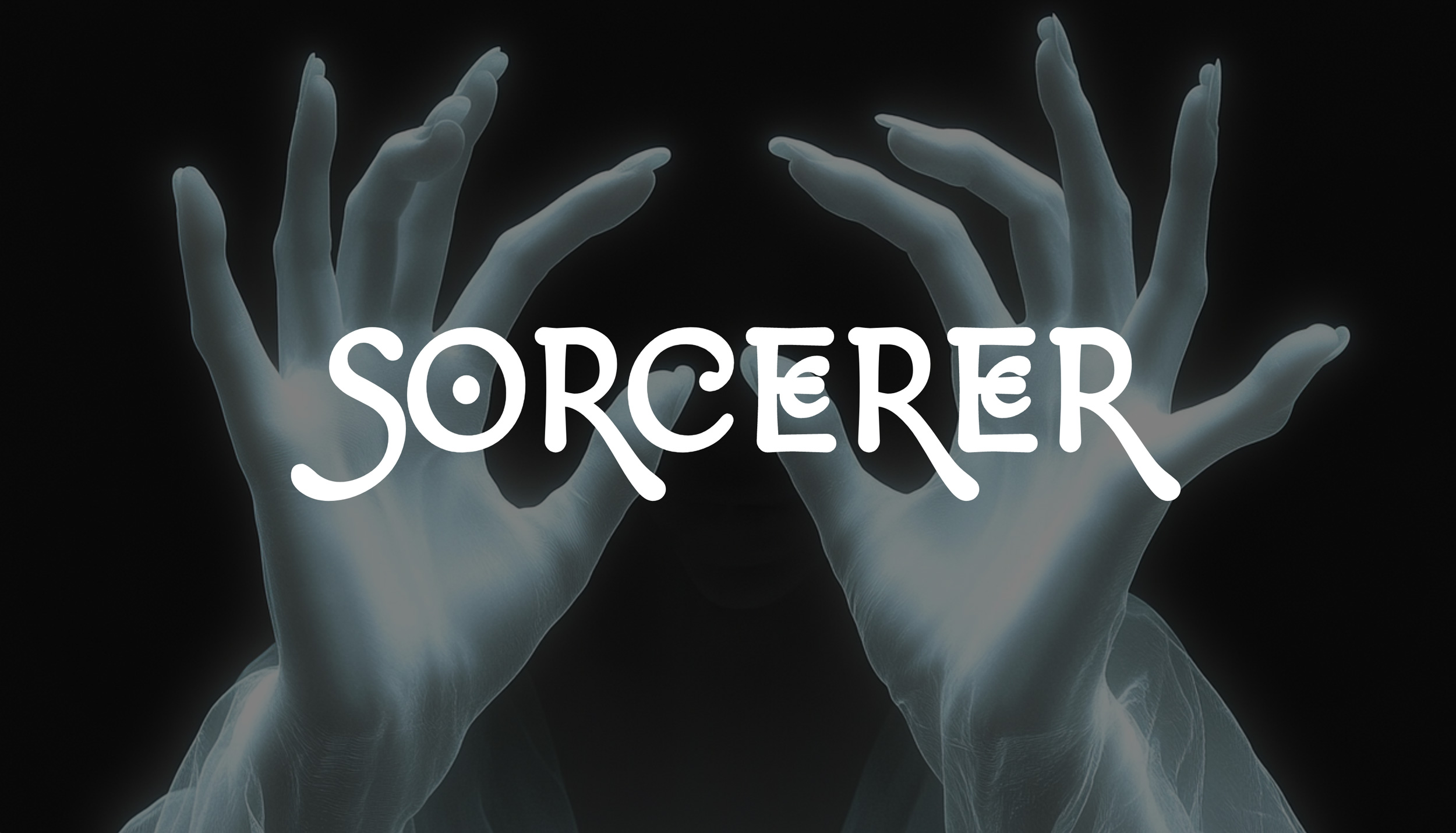
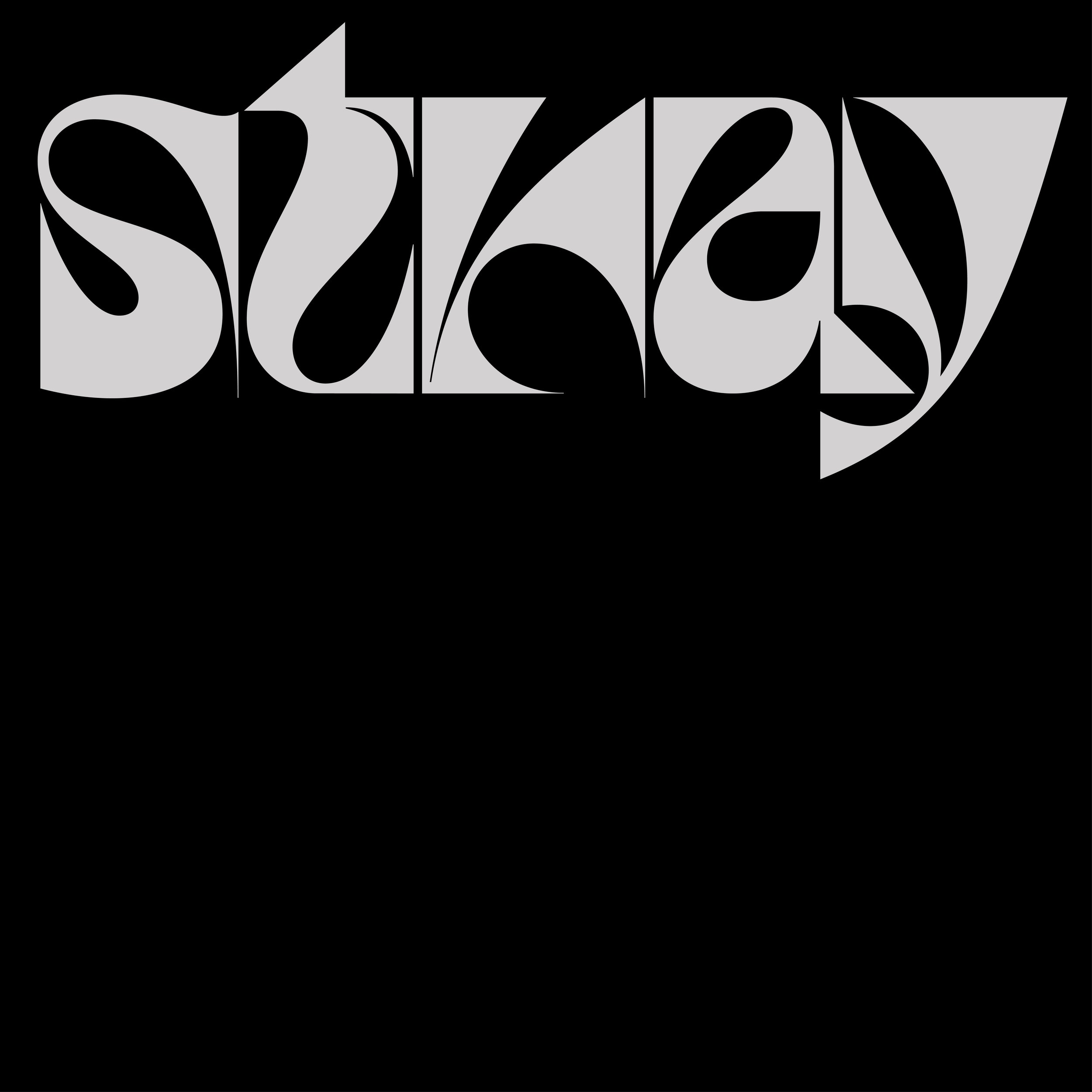
Sorcerer
Sorcerer is a mystical instrument that channels the ancient arts, allowing practitioners to weave melodies through arcane gestures. Like the court wizards of old, users command ethereal forces through ritualistic hand movements, manifesting glowing sigils that pulse with magical energy. The left hand draws forth the fundamental tones and echoes of the void, while the right hand shapes the resonance and harmonious voices. When mastered, one can summon forth cascading arpeggios and shimmering harmonics.
Sorcerer is a mystical instrument that channels the ancient arts, allowing practitioners to weave melodies through arcane gestures. Like the court wizards of old, users command ethereal forces through ritualistic hand movements, manifesting glowing sigils that pulse with magical energy. The left hand draws forth the fundamental tones and echoes of the void, while the right hand shapes the resonance and harmonious voices. When mastered, one can summon forth cascading arpeggios and shimmering harmonics.

INFINITE WONDERLAND
Infinite Wonderland is AI experiment where the timeless classic Alice’s Adventures in Wonderland is endlessly reimagined by artists, AI and you.
Infinite Wonderland is AI experiment where the timeless classic Alice’s Adventures in Wonderland is endlessly reimagined by artists, AI and you.
Plenty
Plenty is an indoor vertical farming company that uses less space and fewer resources to grow flavorful produce. Imagine fruits and veggies replacing chips and soda. The rebrand had two goals. The first was to convey the uniquely craveable flavor of Plenty produce. The second was to create a warmer and more approachable brand that felt accessible to all.
Plenty is an indoor vertical farming company that uses less space and fewer resources to grow flavorful produce. Imagine fruits and veggies replacing chips and soda. The rebrand had two goals. The first was to convey the uniquely craveable flavor of Plenty produce. The second was to create a warmer and more approachable brand that felt accessible to all.


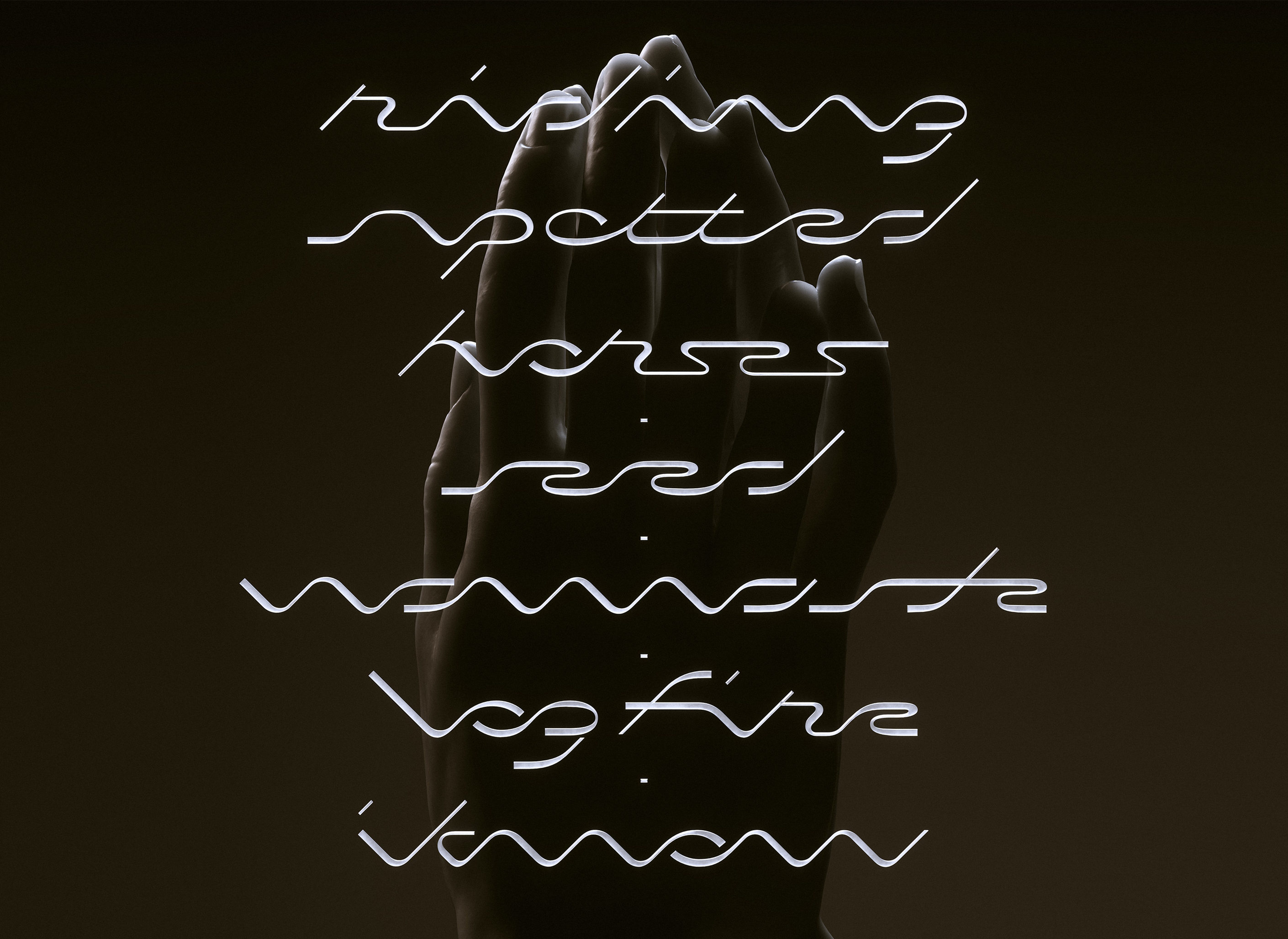
Namaste
Custom type and album for Inspector Maal’s EP ‘Namaste’
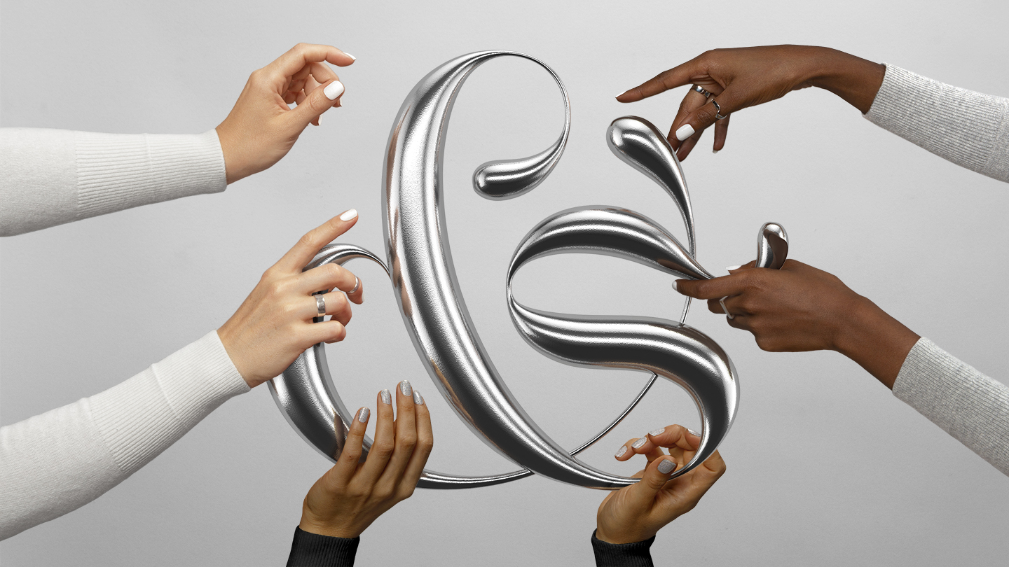
&Walsh
A new look & name for &Walsh’s new chapter with a new vision. What did it take to brand &Walsh? Like all good things in life, it didn’t come easy. It took many talented people, two months of work, drawing 1,230 ampersands, an existential crisis, a lot of coffee, and 42 migraines.
A new look & name for &Walsh’s new chapter with a new vision. What did it take to brand &Walsh? Like all good things in life, it didn’t come easy. It took many talented people, two months of work, drawing 1,230 ampersands, an existential crisis, a lot of coffee, and 42 migraines.
Know Me Better
Know Me Better is Kavya’s debut Album which is a collection of deeply personal songs that describe her life and personality. The album cover is a depiction of a box of easter eggs and ornaments spilling over and creating an organised mess.
Know Me Better is Kavya’s debut Album which is a collection of deeply personal songs that describe her life and personality. The album cover is a depiction of a box of easter eggs and ornaments spilling over and creating an organised mess.
Its Nice That x Google Material Design
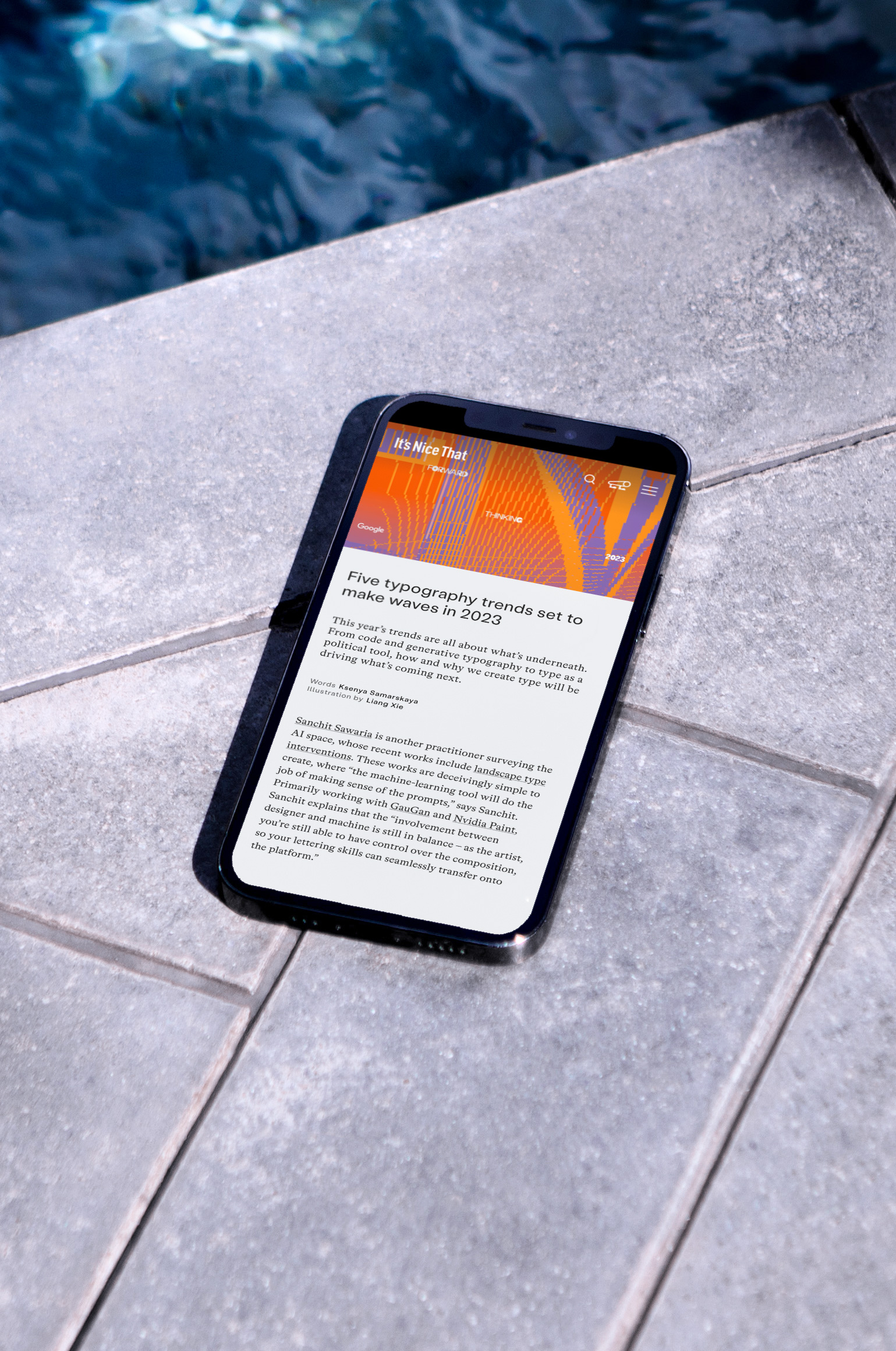
I spoke to Ksenya Samarskaya about an experimental project that uses Gan to generate lettering pieces.
Creative Boom Interview
Gan Experiments got featured on Creative Boom. I talk about generative type and the perception of generative machine learning models.
Gan Experiments got featured on Creative Boom. I talk about generative type and the perception of generative machine learning models.

Bombay 99
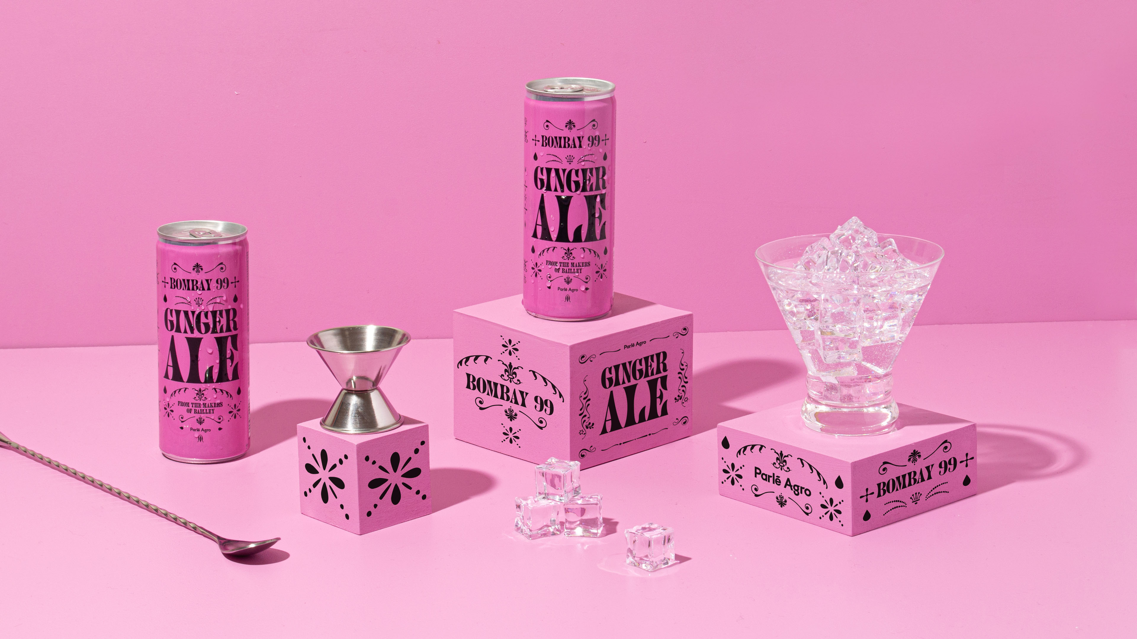
From the makers of Bailley water comes the newest range of mixers crafted to enhance the experience of your favorite drinks. We created the branding & packaging design for the launch of the product line. We brought the branding to life through custom flourishes and ornaments inspired by the shape of a single droplet from a mixer's drink.
From the makers of Bailley water comes the newest range of mixers crafted to enhance the experience of your favorite drinks. We created the branding & packaging design for the launch of the product line. We brought the branding to life through custom flourishes and ornaments inspired by the shape of a single droplet from a mixer's drink.
NYT Opinion
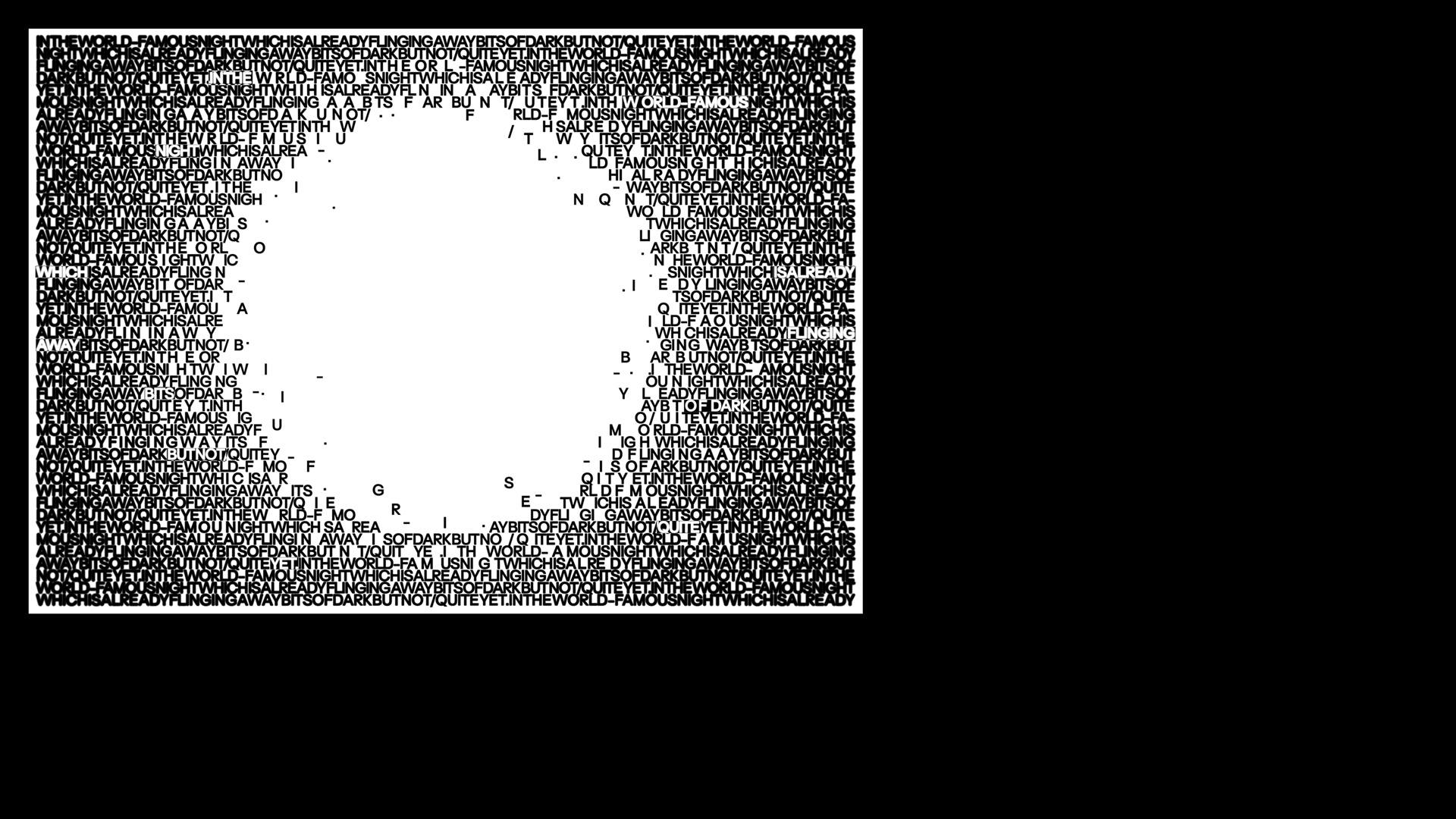
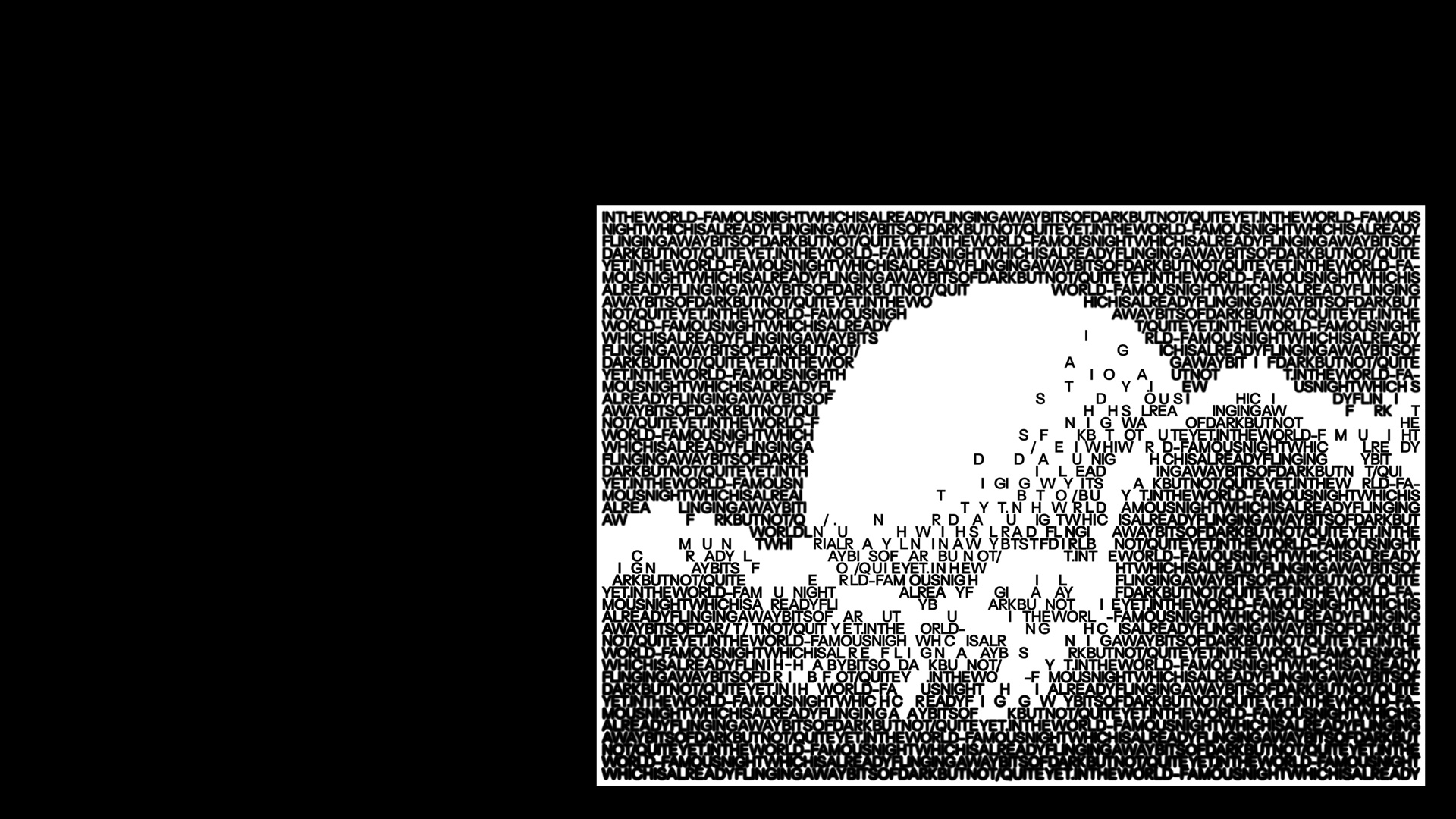
An Editorial Illustration for The New York Times Opinion Book Review. The review features the latest book by Jorie Graham. The image represents a line from Jorie’s poetry “In the world-famous night which is already flinging away bits of dark but not/quite yet.” The composition depicts the transition between night and day/dark and light and also depicts awakening in the shape of a halo.
An Editorial Illustration for The New York Times Opinion Book Review. The review features the latest book by Jorie Graham. The image represents a line from Jorie’s poetry “In the world-famous night which is already flinging away bits of dark but not/quite yet.” The composition depicts the transition between night and day/dark and light and also depicts awakening in the shape of a halo.

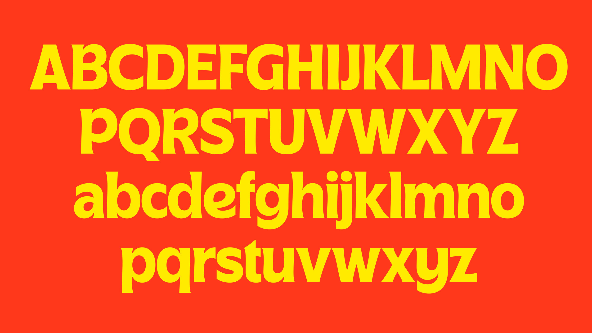
Cassino
An experimental display serif that exaggerates and pushes terminals to the extreme. Inspired by Albertus from 1940, Cassino borrows and modifies features from the appearance of the chiseled classic.
An experimental display serif that exaggerates and pushes terminals to the extreme. Inspired by Albertus from 1940, Cassino borrows and modifies features from the appearance of the chiseled classic.
Herock
Herock is an LP by rapper Sumit Roy.
The lettering is based on Bangla drawings by Satyajit Ray for ‘Hirak Rajar Deshe’. Hirak references the land of diamonds known for its huge mines. Roy uses subversive, trans-continental form of hip hop to articulate ongoing contemporary political anxieties in India.


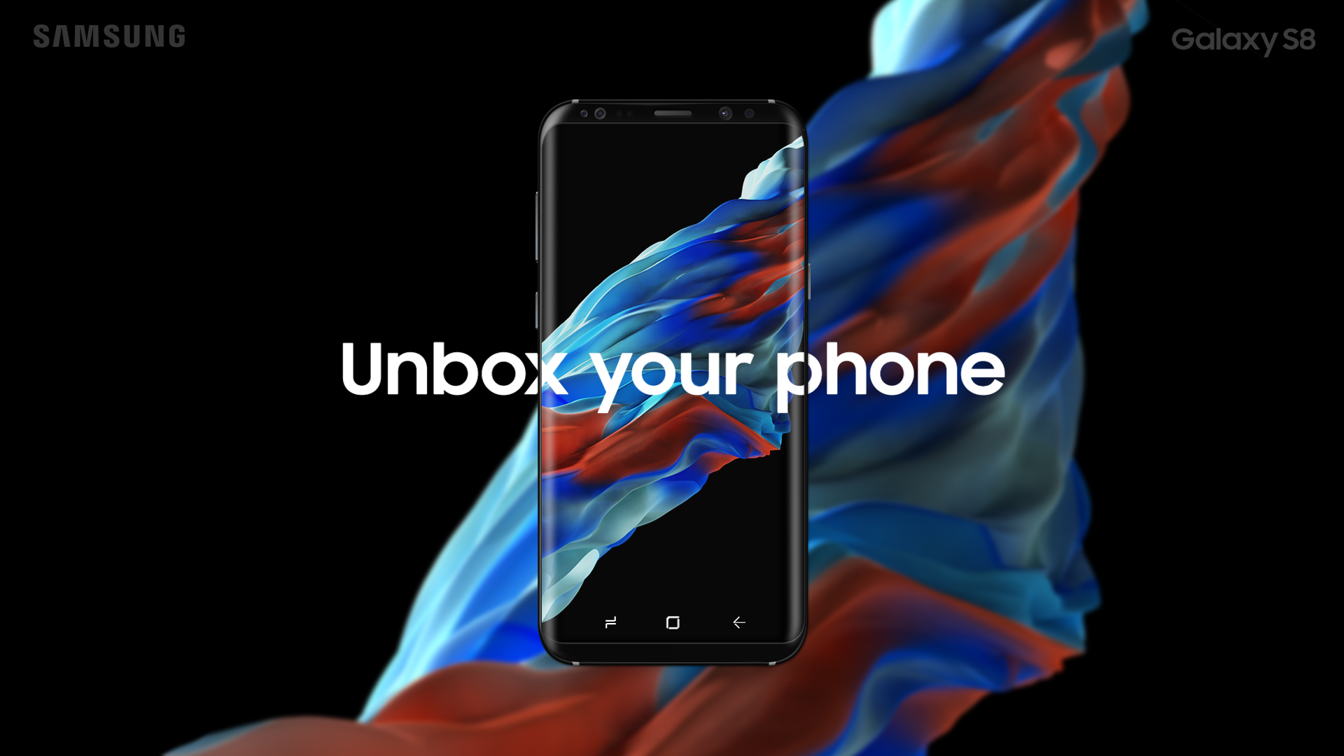
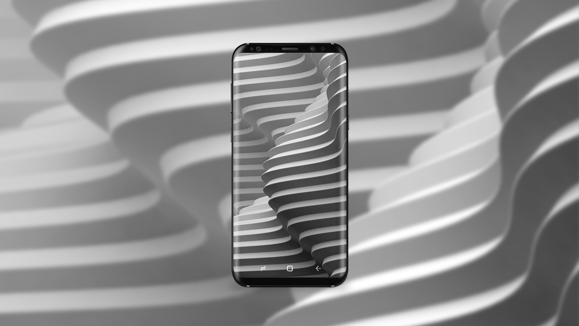
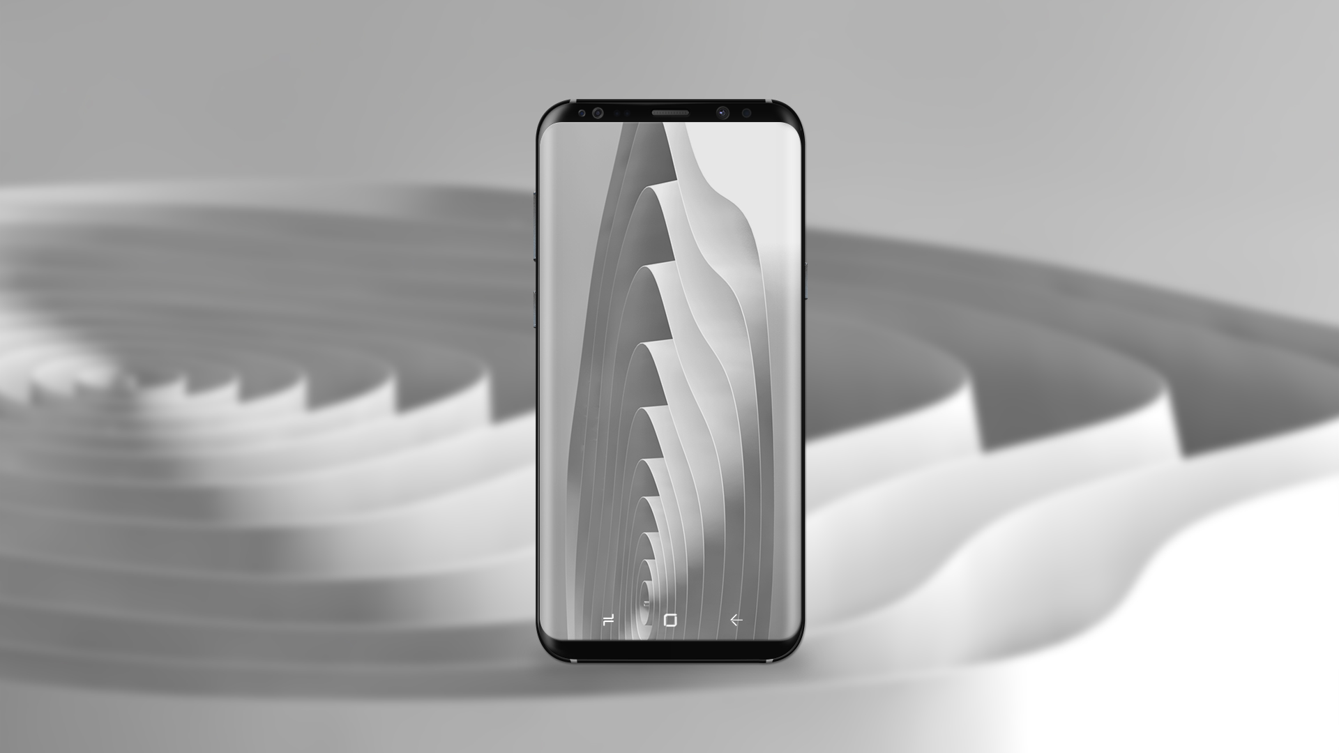
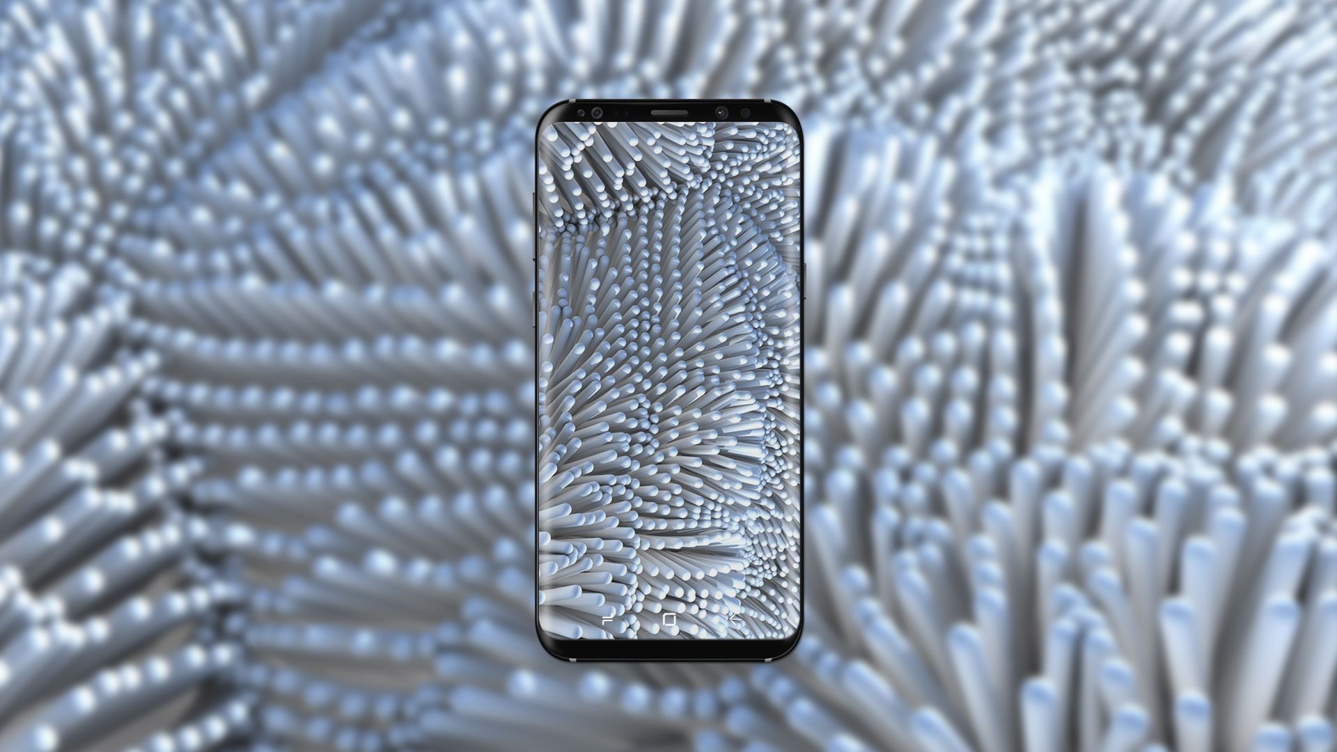
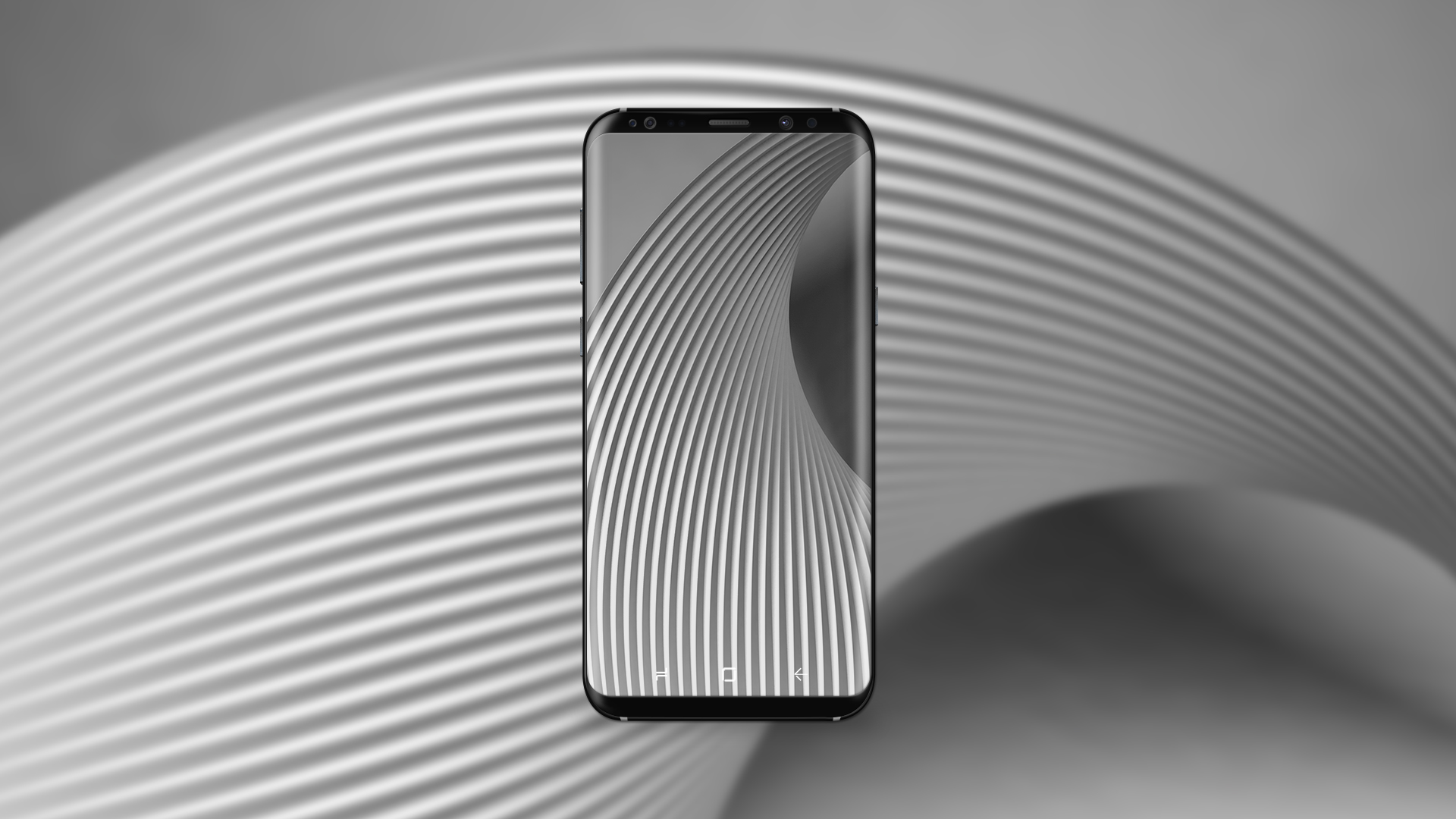
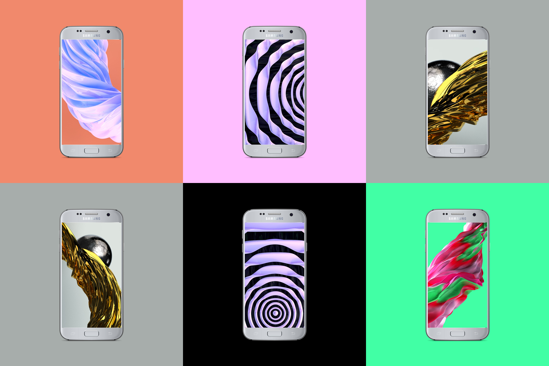
Samsung Wallpapers
Samsung approached us to create illustrations for mobile phone wallpapers and communication graphics. We created a series of wallpapers based on abstract themes of fluidity, liquid metal and paper. The sculptural artworks were designed to create dynamic crops for new phones.
Samsung approached us to create illustrations for mobile phone wallpapers and communication graphics. We created a series of wallpapers based on abstract themes of fluidity, liquid metal and paper. The sculptural artworks were designed to create dynamic crops for new phones.

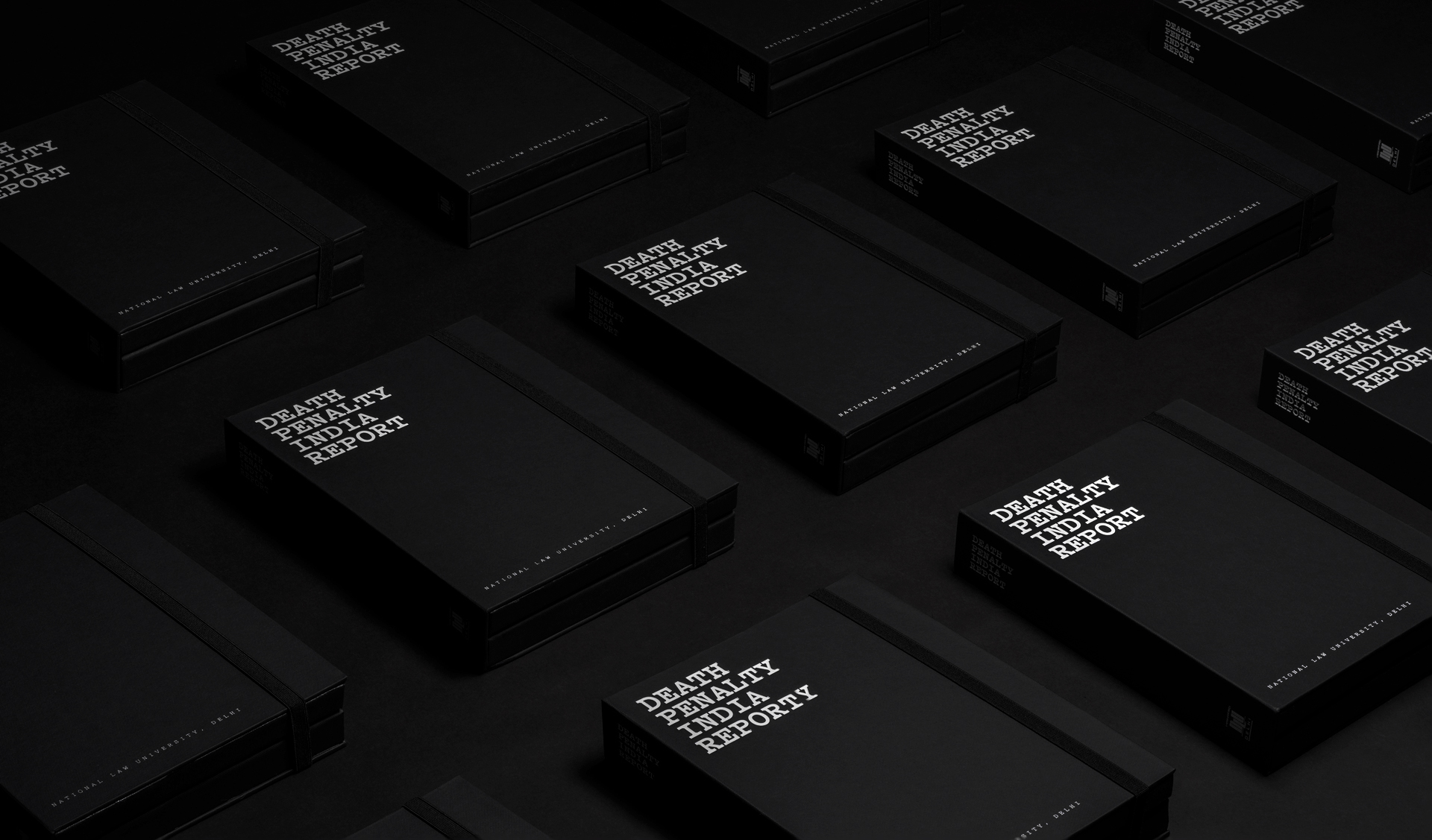
Death Penalty India Report
There have been far too few attempts in India to understand questions about who gets the death penalty, how they get it and what it is like to live under the sentence of death. The Death Penalty Research Project is an attempt by National Law University, Delhi at documenting the socio-economic profile of prisoners sentenced to death in India.
There have been far too few attempts in India to understand questions about who gets the death penalty, how they get it and what it is like to live under the sentence of death. The Death Penalty Research Project is an attempt by National Law University, Delhi at documenting the socio-economic profile of prisoners sentenced to death in India.


Illustration
A collection of illustration in vector and 3d. I treat this as an idea bank of different styles and expressions that are taken from ongoing projects and recreational doodling.
A collection of illustration in vector and 3d. I treat this as an idea bank of different styles and expressions that are taken from ongoing projects and recreational doodling.
Lettering and Type
Typography sketchbook that contains pieces from my typefaces and lettering projects. I treat this space as an experimental concept zone where I push ideas to the extreme which can later be tamed and made usable.
Typography sketchbook that contains pieces from my typefaces and lettering projects. I treat this space as an experimental concept zone where I push ideas to the extreme which can later be tamed and made usable.
Kathrein
Kathrein Privatbank is a leading private bank in Austria, helping clients to better live their narrative with the most personalized private banking experience. Every product and service they offer is in the pursuit of personal.
Kathrein Privatbank is a leading private bank in Austria, helping clients to better live their narrative with the most personalized private banking experience. Every product and service they offer is in the pursuit of personal.


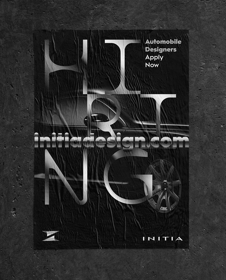
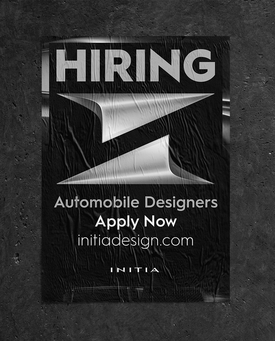

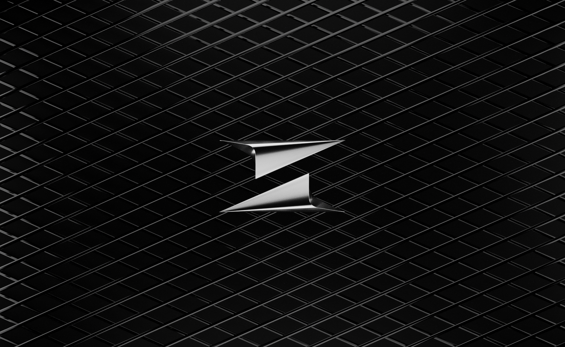
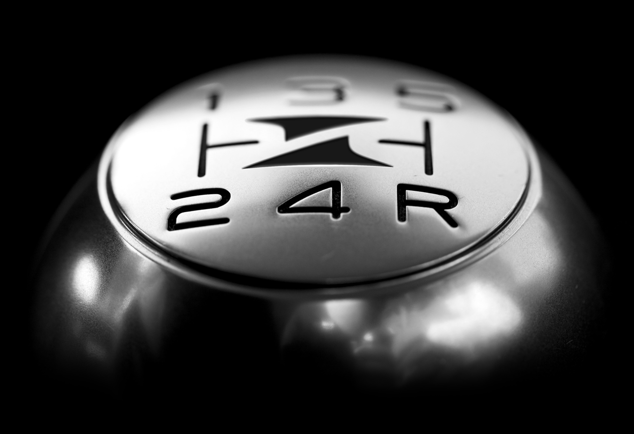
Initia
Initia is an automotive design studio in Pune, India that offers design solutions informed by engineering. The intersection of these two disciplines is represented by two opposite arrows forms the capital 'I' of Initia.
Initia is an automotive design studio in Pune, India that offers design solutions informed by engineering. The intersection of these two disciplines is represented by two opposite arrows forms the capital 'I' of Initia.

Stompy
Stompy is a wine subscription service that intelligently tailors wine selections to your taste buds. When developing the brand identity for Stompy, we were tasked with creating a brand that could bring wine to a more modern audience.
Stompy is a wine subscription service that intelligently tailors wine selections to your taste buds. When developing the brand identity for Stompy, we were tasked with creating a brand that could bring wine to a more modern audience.
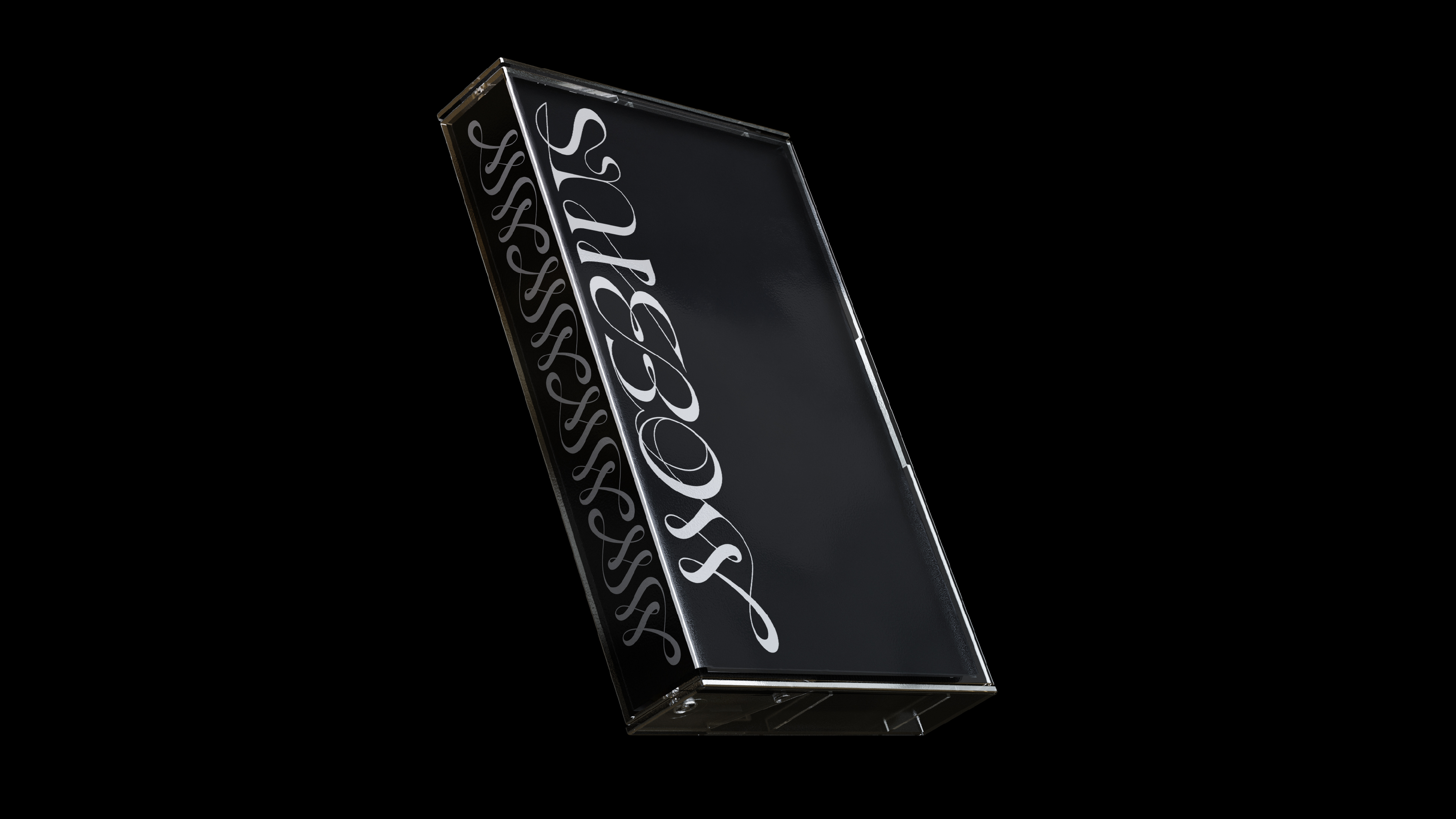
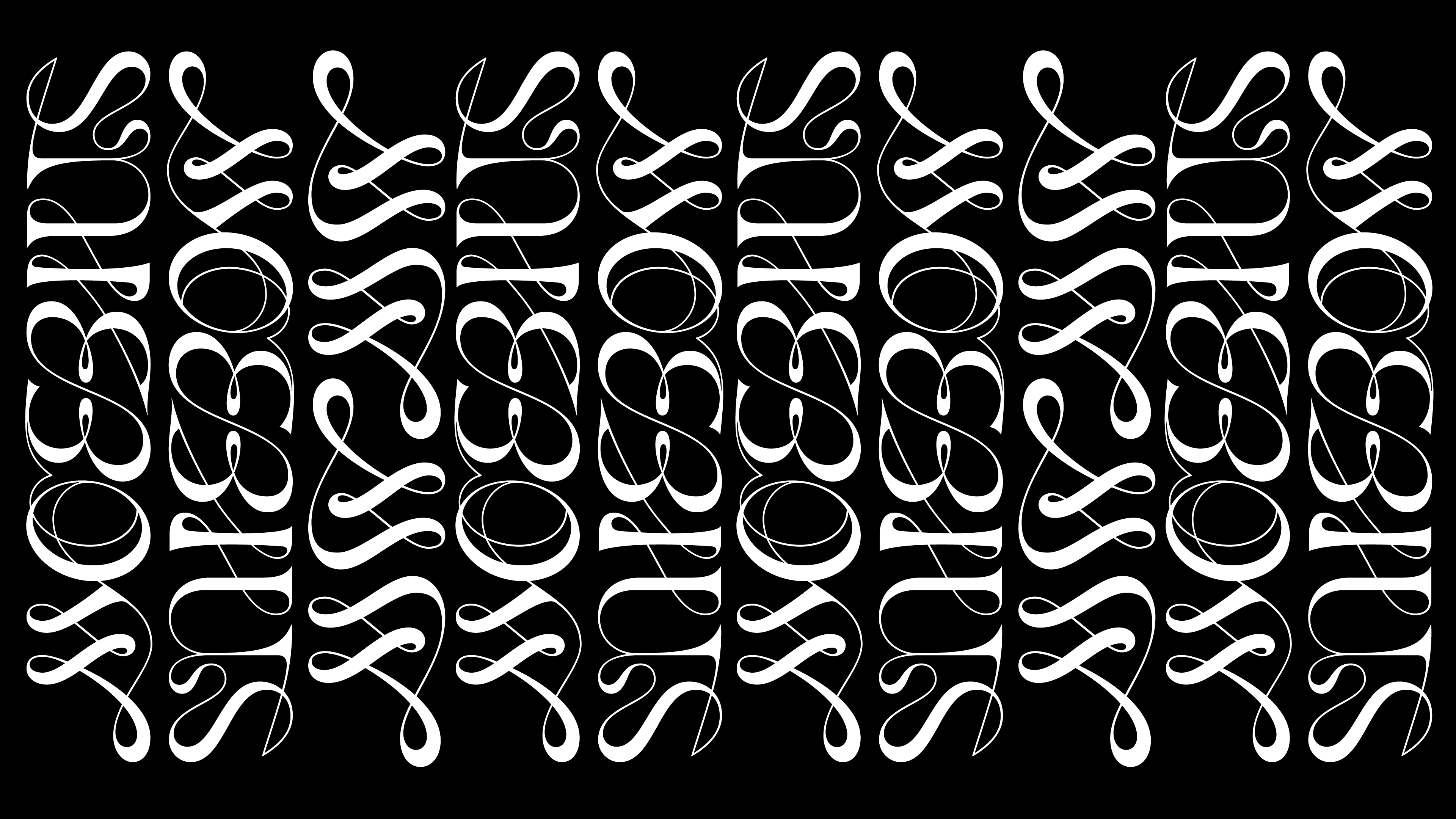
Moebius
The logotype is a script inspired by the infinity symbol and the möbius strip. The high contrast drawing creates a rhythm between moments of intricacy where the hairlines lead into voluminous forms and sharp terminals. Moebius creates music that features themes of cyclic and whimsical movements. The music is nuanced and nostalgic which presented an opportunity to create an ornamental lettering. The M was pulled out and crafted to serve as a monogram that captures the leading characteristic of the möbius strip.
The logotype is a script inspired by the infinity symbol and the möbius strip. The high contrast drawing creates a rhythm between moments of intricacy where the hairlines lead into voluminous forms and sharp terminals. Moebius creates music that features themes of cyclic and whimsical movements. The music is nuanced and nostalgic which presented an opportunity to create an ornamental lettering. The M was pulled out and crafted to serve as a monogram that captures the leading characteristic of the möbius strip.